Tuesday, December 10, 2013
Monday, November 18, 2013

Thursday, November 14, 2013
Typhoon Haiyan

Satellite imagery of Tacloban coast before and after the typhoon in the Phillipines.
Link: http://www.telegraph.co.uk/news/worldnews/asia/philippines/10446056/Typhoon-Haiyan-Satellite-imagery-shows-before-and-after-devastation.html
Tuesday, November 12, 2013

Friday, November 8, 2013

Wednesday, November 6, 2013
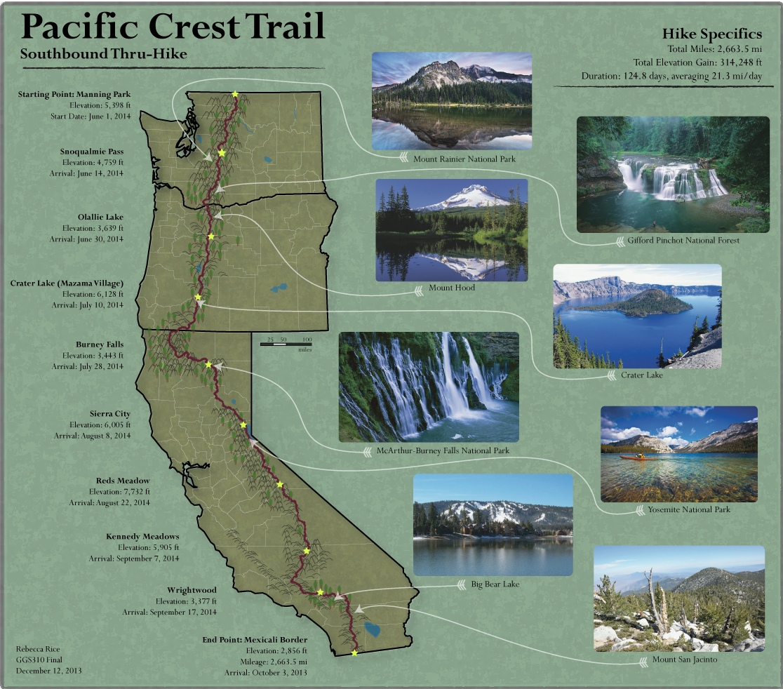
Final Project Proposal: PCT Map
For my final project I am going to create a map of the Pacific Crest Trail (PCT), including a route for a thru-hike that includes resupply points and potential scenic stops along the way. The PCT is a 2,663 mile trail that extends from the California/Mexico Border all the way through the Sierra Nevada to British Columbia, Canada. I would like to map the PCT because I think it would render the possibility of a very unique map. I first became interested in the PCT after reading Wild, a memoir by Cheryl Strayed of her thru-hike of the PCT. A few years ago, one of my good friends hiked the Appalachian Trail, and he's been encouraging me to try it once I graduate. I feel like hiking the PCT would be more of an accomplishment since it's longer (the AT is 22,00 mi), more scenic, and something that no one else I know has done. Creating this map will help me improve my knowledge of the PCT and may be more of a motivator for me to actually do it someday!


The map will include California, Oregon, Washington, and part of BC, Canada. I am going to obtain my data from the official PCT Association website (http://www.pcta.org/discover-the-trail/long-distance-hiking/). I'm also going to look at thru-hike blogs for more information on cool stopping points along the trail. I plan on obtaining a shapefile from the ESRI online database to include the 3 states and part of Canada I will include.
Wednesday, October 30, 2013
Dot Density Map

Flickr and Twitter Posts in Europe. Red dot indicates location of Flickr post, Twitter is blue, and white indicates both.
Source: Flickr
Monday, October 28, 2013

Saturday, October 26, 2013

Tuesday, October 22, 2013

Tuesday, October 15, 2013
Lab 6: Color Choropleth Map

Map Utilizing Color

Saturday, October 5, 2013


Tuesday, October 1, 2013


Sunday, September 29, 2013

Thursday, September 19, 2013

Thursday, September 12, 2013

Thursday, September 5, 2013
U.S. Rivers

Azimuthal Projection of Antarctica's Time Zones


Thursday, August 29, 2013

This map illustrates the amount of hunting that occurs in different areas of the United States (lower 48). I chose it because it is easy to understand and the color scheme fits with the theme (hunting). It is interesting because there appears to be very little hunting on the coasts, and a lot more hunting in the north and west/mid-west. I also chose it because it is accurate as a choropleth map, as the data is standardized as percentages, and the color scheme makes sense. The link also contains some more interesting thematic maps.
Subscribe to:
Comments (Atom)